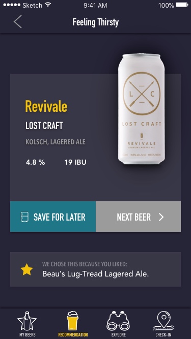
Beer Buddy App
[00]
The Concept
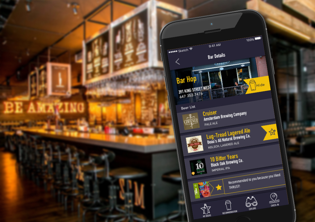
A Mobile app for exploring the beers in the current market and guide users through making better beer choices.
[01]
The Challenge
Problem Space
The beer industry has exploded with a variety of crafted brews and there are too many different products and microbreweries to be able to keep track of. It’s a difficult world to navigate and not easy for consumers to know where to begin.
Some of the pain points beer enthusiasts have:
“Have I tried this one already?”
“What was the name of the microbrew I liked last summer?”
“All these different types seem so complicated.”
“There are too many choices how do I know which beer I would even like?”
Hypothesis
I believe that designing a tool to help navigate the craft been market for beer enthusiasts will help increase more adventurous choices and provide a more informed experience.
[02]
The Research
Current Market
Next Glass
strange mix of beer AND wine
no tasting notes of profiles
doesn’t reflect current market inventory
very few Canadian products
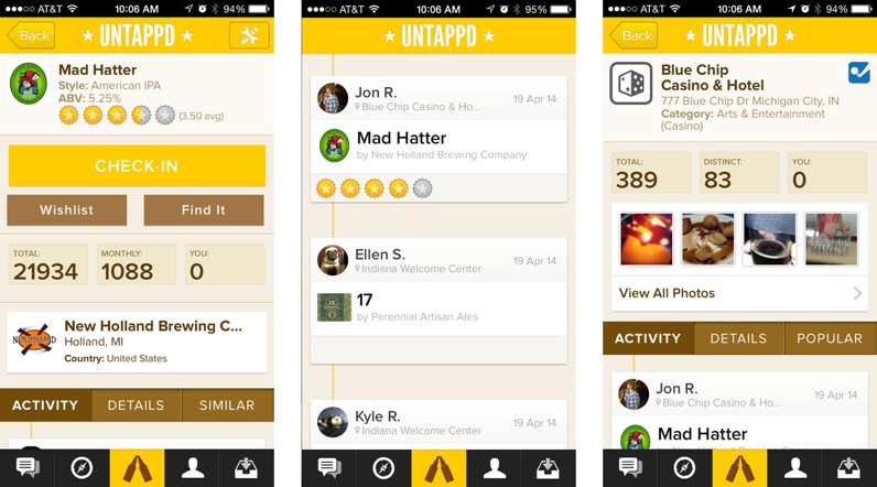
Untappd
overly complicated
gamification aspect that seems distracting from the core features
large digital social interaction element
ratings are based on other users tastes and not helpful to individual preferences.
user generated images which are inconsistent and not uniform
User Research
I conducted a series of interviews asking questions based on assumptions I had made around the current problem space. The results revealed that many drinkers:
Generally like trying beers based on recommendations, but not always certain if its given by someone of similar tastes.
Would like to know more about a new product but don’t want to interrupt friends or bug a busy bartender.
Like to explore new beers, but can’t keep track when exploring multiple options at one time.
Personas
Using the information gathered from the interviews, an assimilation of key attributes were formed to create personas. These personas will be helpful to guide the direction of design based on the analysis of the users key needs.


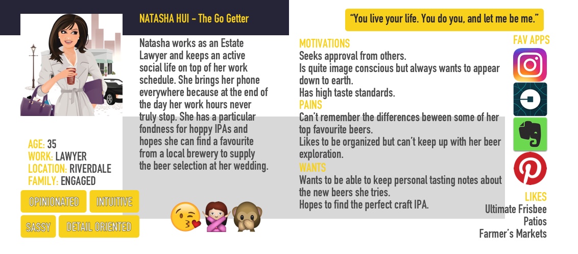
From there I created an Empathy Map and an Experience Map based on the persona. This benefited me in finding a scenario that helps illustrate the problems and motivations of the target user. This allows a deeper connection to understanding the user and I was able to gain insight into the pain points and needs of the user to focus the direction of design for the app.
Goal
To design an app that will help young to middle-aged beer enthusiasts who want to better navigate their beer journey by keeping track of the beers they enjoy and suggesting beers like the one’s they have previously tasted ultimately increasing their overall knowledge of the industry.
[03]
The Process
Sketching & Wireframes
User flows were created for various tasks in the app concept to provide a general idea of the Information Architecture before sketching began. Post-its were very helpful in rearranging the order of decisions and actions.
Once I decided on the epics to capture, I began sketching out various ways to layout the screens.
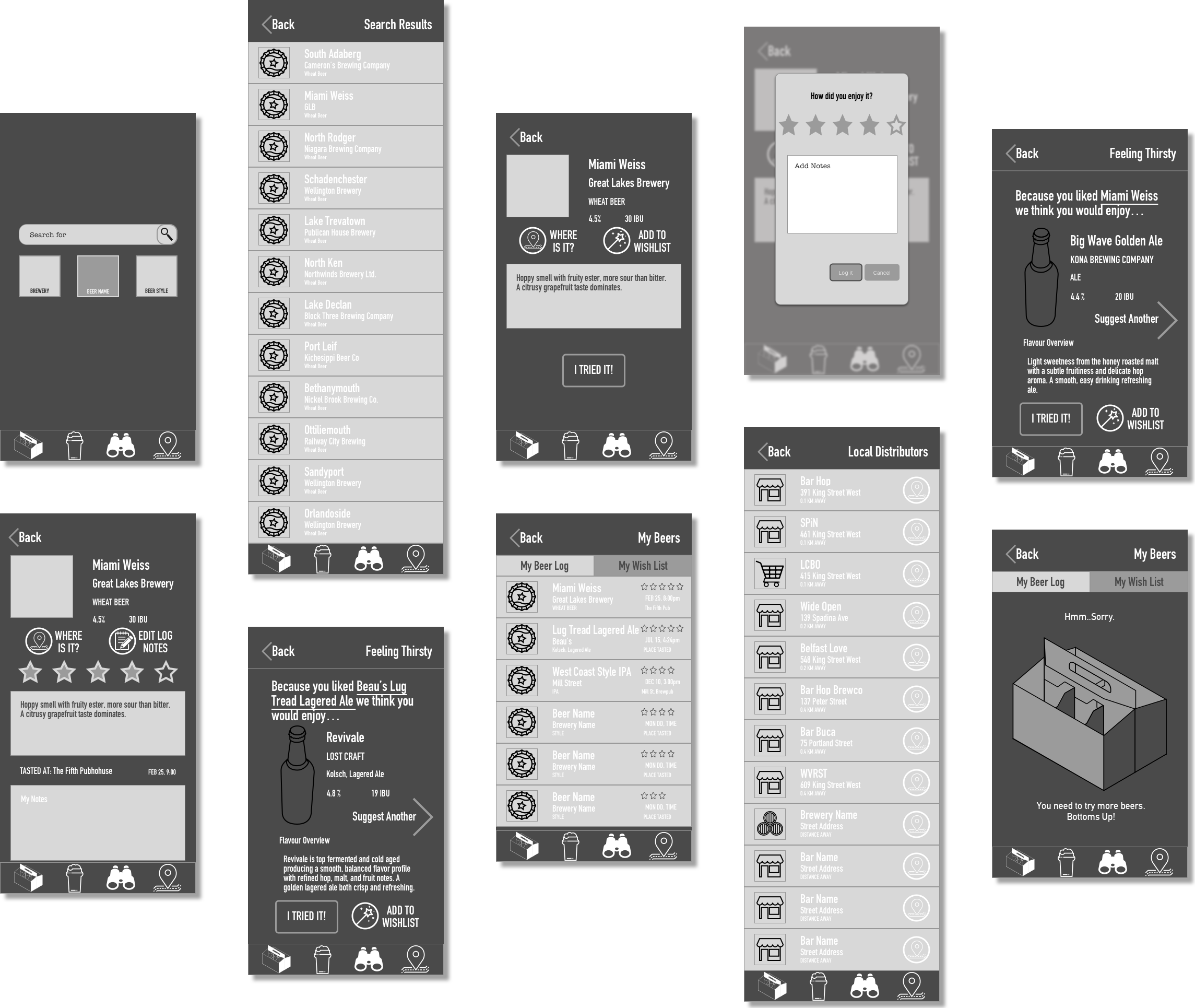
Translating my sketches into Wireframes allowed me to build a prototype that I could use to bring to my users for testing.
Iterations
From the paper sketch stage and throughout the levels of wireframing, I ensured to always go back to the user to test each new implementation of design. As I began to bring UI into the wireframes I continued to gather feedback from testing which continued to drive the design.
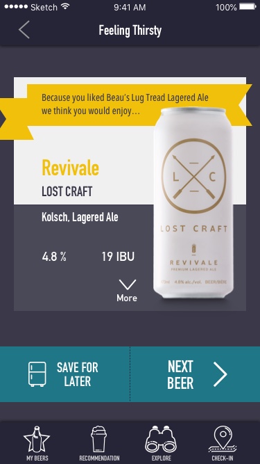
The below images shows the evolution of one of the screens based on the insights and any difficulties navigating observed during user testing. Some elements would be changed or altered to remove any paint points the users might have.
UI Library
While designing the UI of Beer Buddy, consideration had to be made that the user would most likely be in a dark or low light setting. An overall dark colour was decided on since this would help the user be able to navigate the information on the screen on the app with ease.
Complimentary colours were added to provide enough contrast for the eye to quickly notice Call-To-Action areas on the screens.
Type with a bold sans-serif but with an command sense was chosen to give a clean easy read to the information but also invoke an authority of knowledge.
[04]
The Solution
Prototype
Below is a clickable prototype of my concept app with the final UI implemented. I used Invision to provide a navigational design to mimic a finished product. Please browse through to navigate the various screens.
