Borderless Magazine Layouts
An editorial perspective for a travel magazine with layouts for features, regular columns, and cover.
[00] The Concept
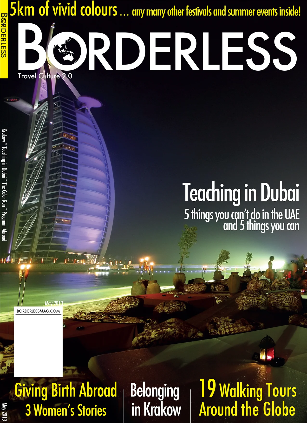
Cover and Brand
A variety of covers were designed to provide a voice to the concept of the magazine. Mockup designs that included several pitch ideas for feature stories were laid out on the cover spread paired with a bold photo.
A persona was created to drive the focus of the design and ensure the right audience was always in mind when exploring options. The main traits could be described as someone who considers themselves a ‘global citizen’ and seeks travel in a bit more “off the beaten path” fashion. Several titles were selected and asked to be rated by a variety of potential readers that matched the persona. Borderless as a brand name was selected to best fit the character necessary to entice the desires of the readers. A logo was crafted for the title using a bold and authoritative font thats reads modern and clean to invoke a reliable resource as an identity to the magazine.
Regular columns
The magazine was divided into sections with regular columns in each. Each section was “branded” with a colour and passport stamp to easily identify which portion of the magazine you were currently in. Bright colours were incorporated into the columns of design to provide a sense of whimsy to appeal to the adventure seeking that comes with travel. This helps counter - balance the strong presence that the font choice reads.
Features layout
Several features were conceptualized and turned into a multi-page layout spread. A break in the design of the layout needed to reflect a visual separation from the regular columns to indicate to the reader a change between regular column and longer feature writings.


